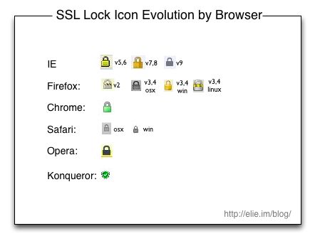
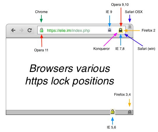
Since the introduction of HTTPS by Netscape, the lock icon have been the indicator of choice to tell users that their communication is secure. Over the years, this prestigious icon shape and position kept changing from browser to browser and from version to version so I made a couple of infographics to illustrate this. I hope you will enjoy them.
Evolution of the lock shape
The first infographic below show the evolution of the lock icon itself. The first thing that infographic show is that beside Safari, every major browser vendor keeps revamping the lock icon from time to time. I have included Konqueror in the infographic because, it is the only that uses a shield as security indicator, despite users studies showing that the lock is the best indicator for SSL Don’t be surprise to not find Firefox 5+ in the infographic, it was remove (you know have a blue box on the right of the URL when SSL is on) Finally one thing that keeps puzzling me is why the Safari (every version) and Firefox icon (some version) are different depending of the OS?

Evolution of the lock position
The second infographic show you where the lock is displayed in the browser. One thing to note is that Safari icon position is different whether you use it on Windows or OSX.

Realizing the diversity of lock shapes and positions makes me wondering if it is not one of the reason why users are confused and sometime have hard time to know if the connection is secure or not. Maybe we should standardize the security indicator shape and position ? Thanks for reading this post. If you like it please sharing it with the world, it makes me happy. You can follow me on Twitter @elie or on Google+


