Whats the best icon to entice people to share something through their social networks? It turns out to be the one used on Android. While this may contradict guidelines proposed by some designers, this conclusion is based on the results of a survey of 7,500 users. I conducted the survey using Google Consumer Surveys this month. Over the last decade or so, web and app designers have sketched out innumerable icons to represent the action of sharing: boxes have sprouted arrows, circles have been placed in orbit, and one particularly forgettable instantiation of Windows Phone decided to import a gift-wrapped present. Whats remained unclear all along, however, is which one users actually recognize.

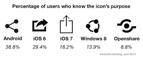
To help this answer this question, I ran a survey asking 7,500 U.S. respondents if they knew what various popular icons depicted in the figure above are used for. I also asked them which one they preferred to use for sharing using a side-by-side comparison. (This survey produced statistically significant results.) Overall, 38.8% of the respondents know what the Android share icon means. 29.4% correctly identified the curved-arrow pre-iOS 7 icon, and only 18.2% said iOS 7s vertical-arrow is used for sharing. The Microsoft Windows 8 sharing icon fared more poorly, with only 8.8% of respondents knowing what it means. 11.4% said it would be used to connect to a WiFi network and 65.5% flat-out said they didnt know.


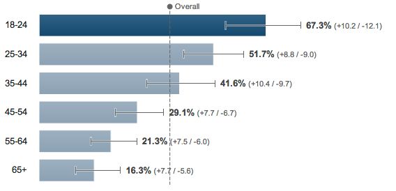
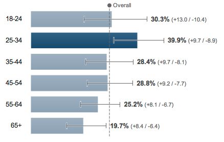
As illustrated in the first above chart, its clear that younger people are better informed about what the Android icon means. By contrast, as you can see in the second chart, the greatest number of people who correctly said the two iOS icons were used for sharing were a bit older. The largest number fell in the 25 to 34 range: 39.9% for pre-iOS 7 and only 27.9% for the new iOS 7 icon.

29.4% of survey respondents said that, given a choice, they would pick the pre-iOS 7 curved-arrow icon for sharing. Despite being the best-known one, only 21.3% favored the Android icon. 18.6% selected the Microsoft Windows 8 icon, 17.4% the iOS 7 icon, and 13.3% the open share icon. These numbers show that the industry still has much education to do regarding what these different icons mean. It would be interesting to compare these recognition percentages not one of which topped 40% to ones that have more standardization, like WiFi, search, and cellular network strength. Drop me a comment below to let me know what you think of the this survey, and if you would like more of those (and on which topic?). Don’t forget to share / like / +1 this post if you liked it thats a good indicator for me that people care.


